
Tesla M3 Dashboard + Service Design
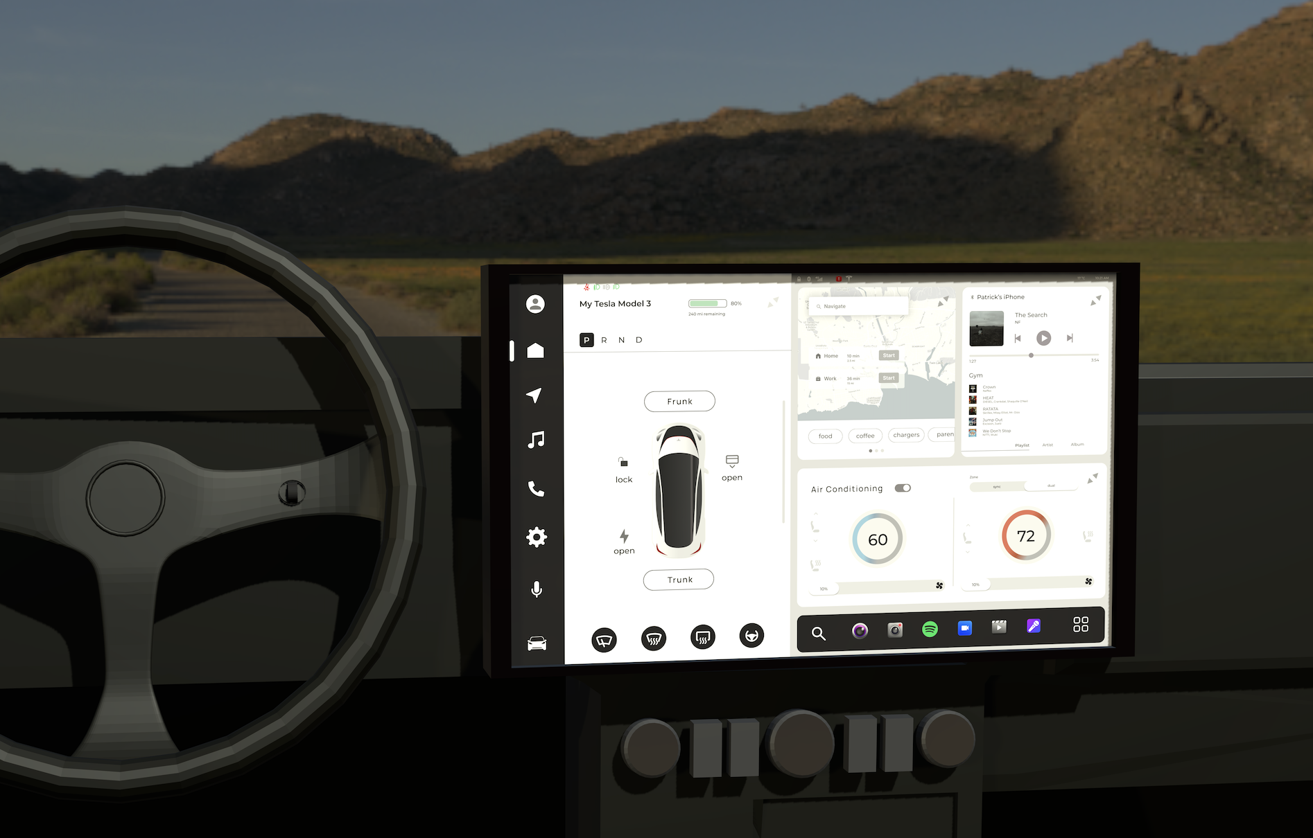
I approached this project with lots of questions after renting a Tesla and experiencing this challenges of this full-touchscreen interface. Curious to understand what pain points Tesla owners struggled with on a daily basis, I began looking at secondary research to guide my project, as well as conducting interviews with Tesla owners to discover their frustrations. After several iterations, I created a 3-d mockup in blender of the new dashboard for an immersive experience.
Problem
In its current state the Tesla Model 3 dashboard has three big issues that contribute to long task times when glancing away from the road to the screen.
low contrast
implicit affordances
icons too small (1cm x 1cm at the smallest) 1mm = 3.4px 48px x 48px is the recommended touch target size
How might we reduce the length of attention required for essential tasks?
Solution
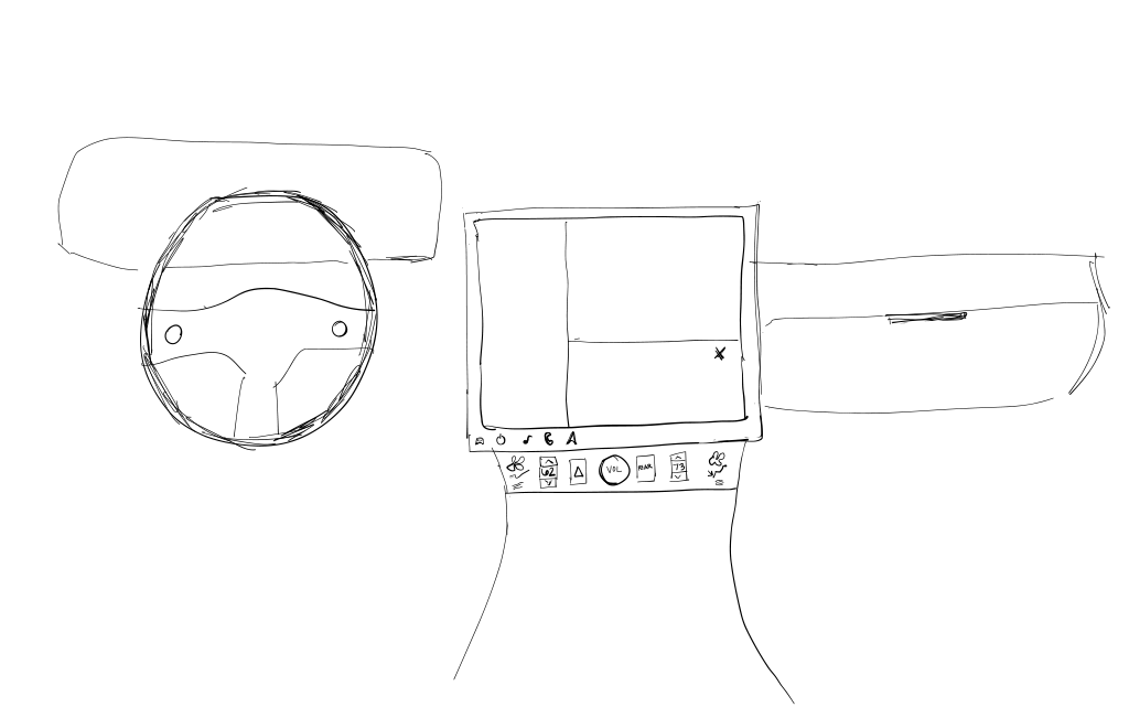
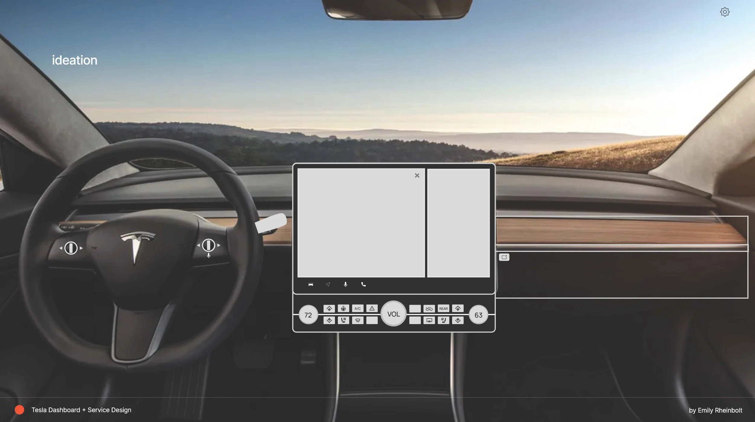
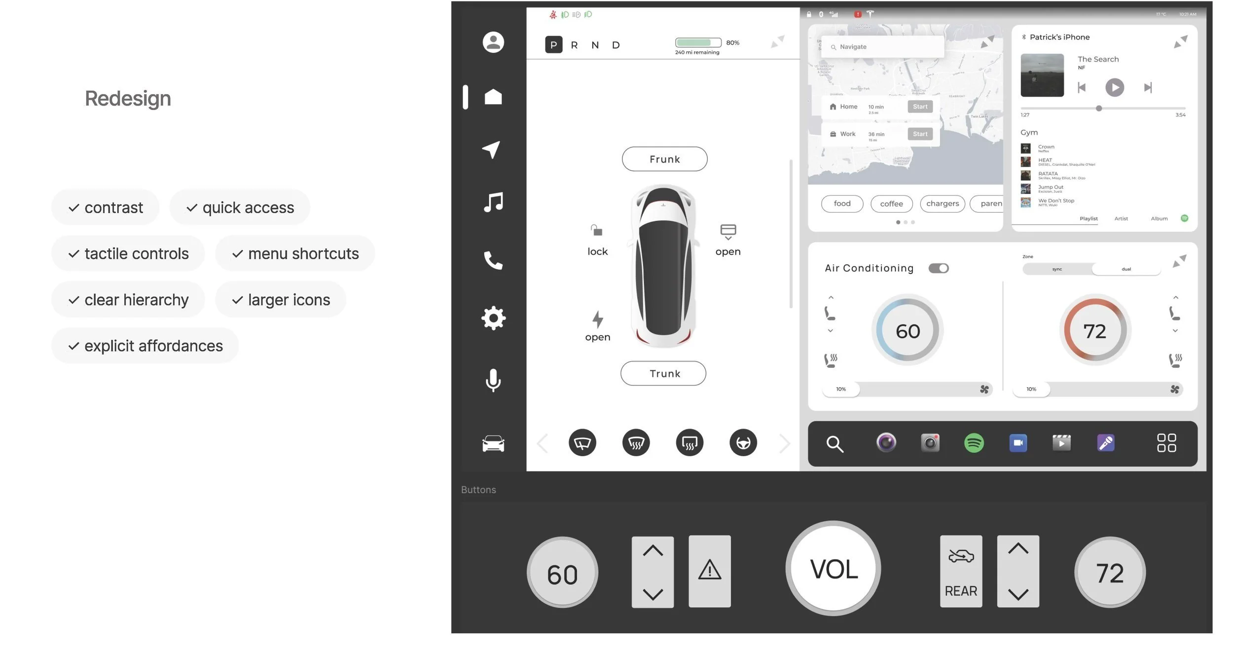
By introducing physical buttons and/or knobs, increasing the interface contrast and touch target size, safety for users will increase and be more design inclusive.
Role
UX / UI Designer, UX Research
Tools
Figma
FigJam
Zoom
Google Docs
Blender
Duration
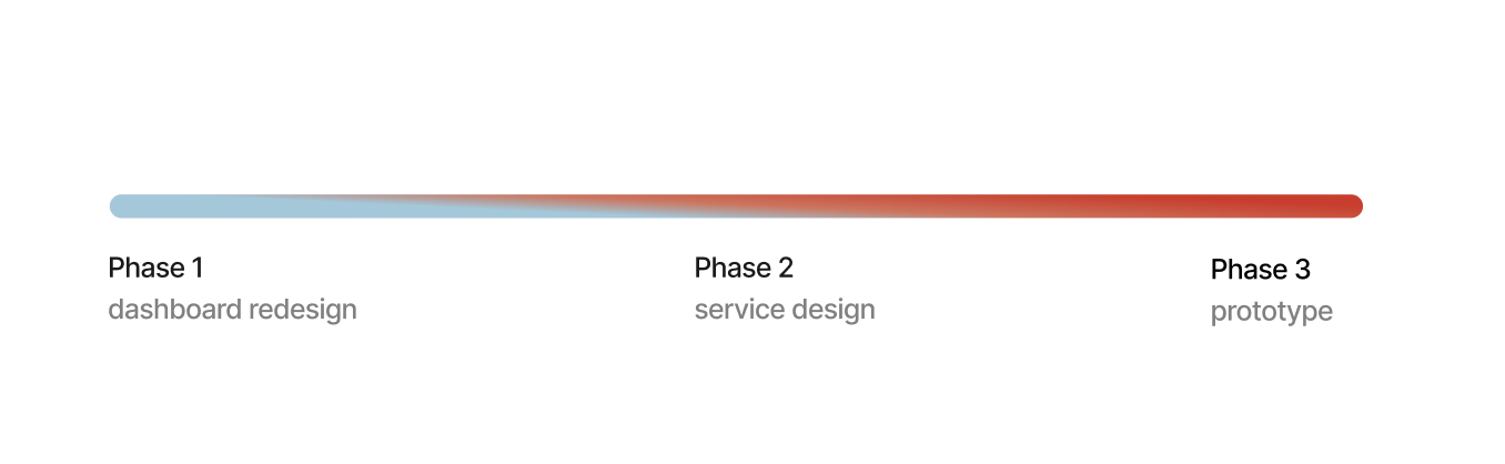
10 weeks
Discovery & Research: 2 weeks
Design & iterations: 8 weeks
Process Included
Research
Task Analysis
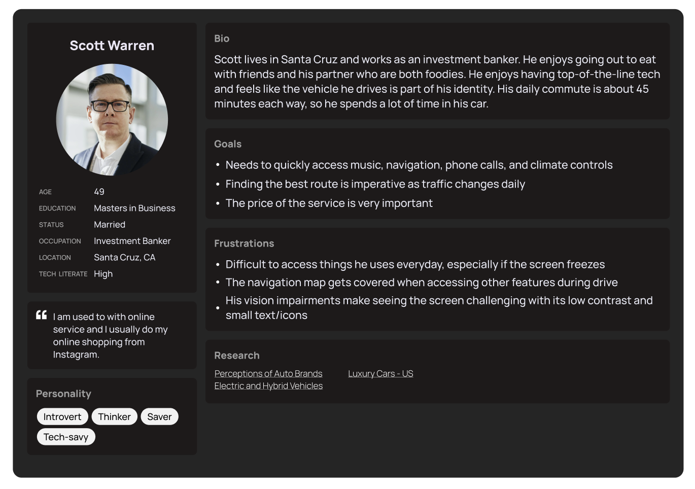
Persona Development
Wireframes
HiFi Screens
Blender Modeling
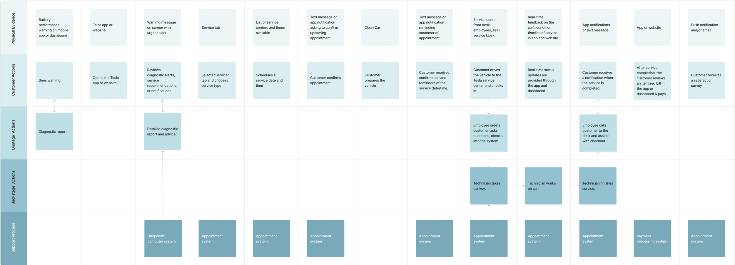
Service Blueprint
Customer Journey Map
Company
ArtCenter College of Design
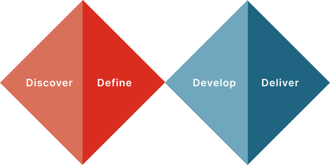
Process
Discovery
statistics
Tesla safety
18%
Only 18% of consumers aged 18+ perceive Tesla to be a safe auto brand.
23.54 accidents / 1,000 drivers
2+ seconds
22%
of glancing away from the road doubles the risk of a crash
of 22% of glances exceed 2s with Auto Pilot enabled
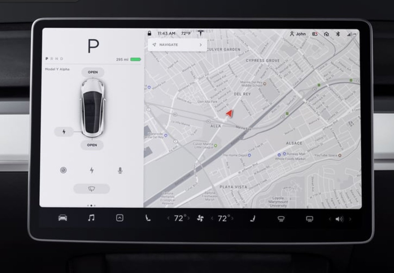
Current State
task analysis
statistics
what users want
87%
85%
78%
76%
advanced hazard warning
traffic and safety camera warnings
remote vehicle command functions
predictive maintenance functions
Define
How might we reduce the length of attention required for essential tasks?
Delivery

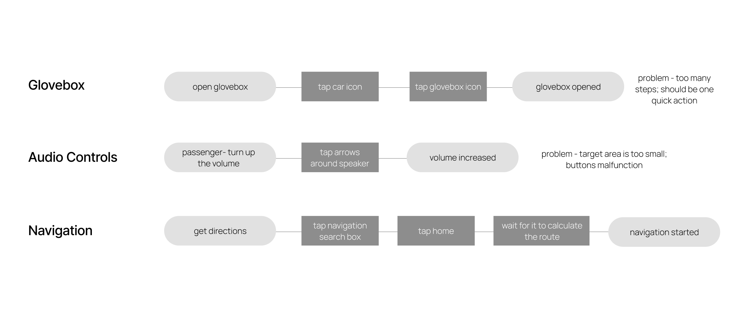
user testing takeaways
Some users preferred the original interface because that is what they were accustomed to. Others with no experience using the Tesla dashboard liked the accessibility the new version allowed. Further testing would be required to make more adjustments.
volume
One user initially thought you would tap the mic to adjust the volume, until he saw the volume knob present. He liked the idea of a quick and tactile solution, but recommended arrows.
glovebox
There was some hesitation present in multiple users before making a decision here. It is possible that the glovebox icon Tesla uses just isn’t universal enough, and adding the word “glovebox” could be useful.
navigation
Because the quick navigation shortcuts do not sit directly under the navigation search bar, some disconnect was present and additional time was taken before two users made a decision here, but overall users found this task easy to accomplish in one step.
Service Design
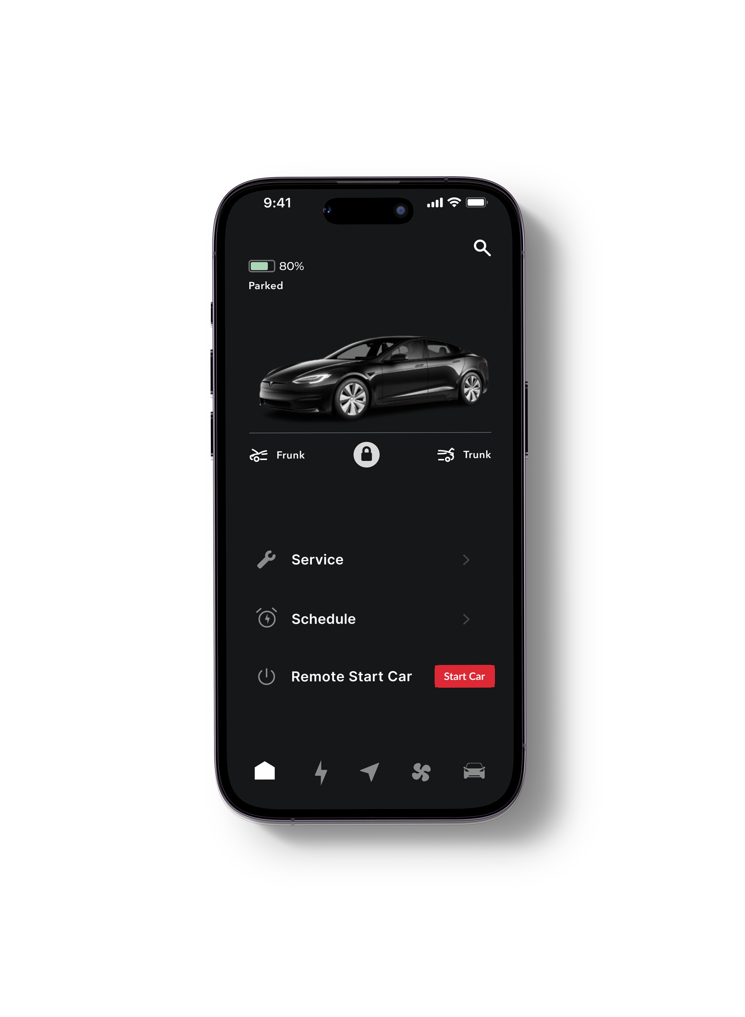
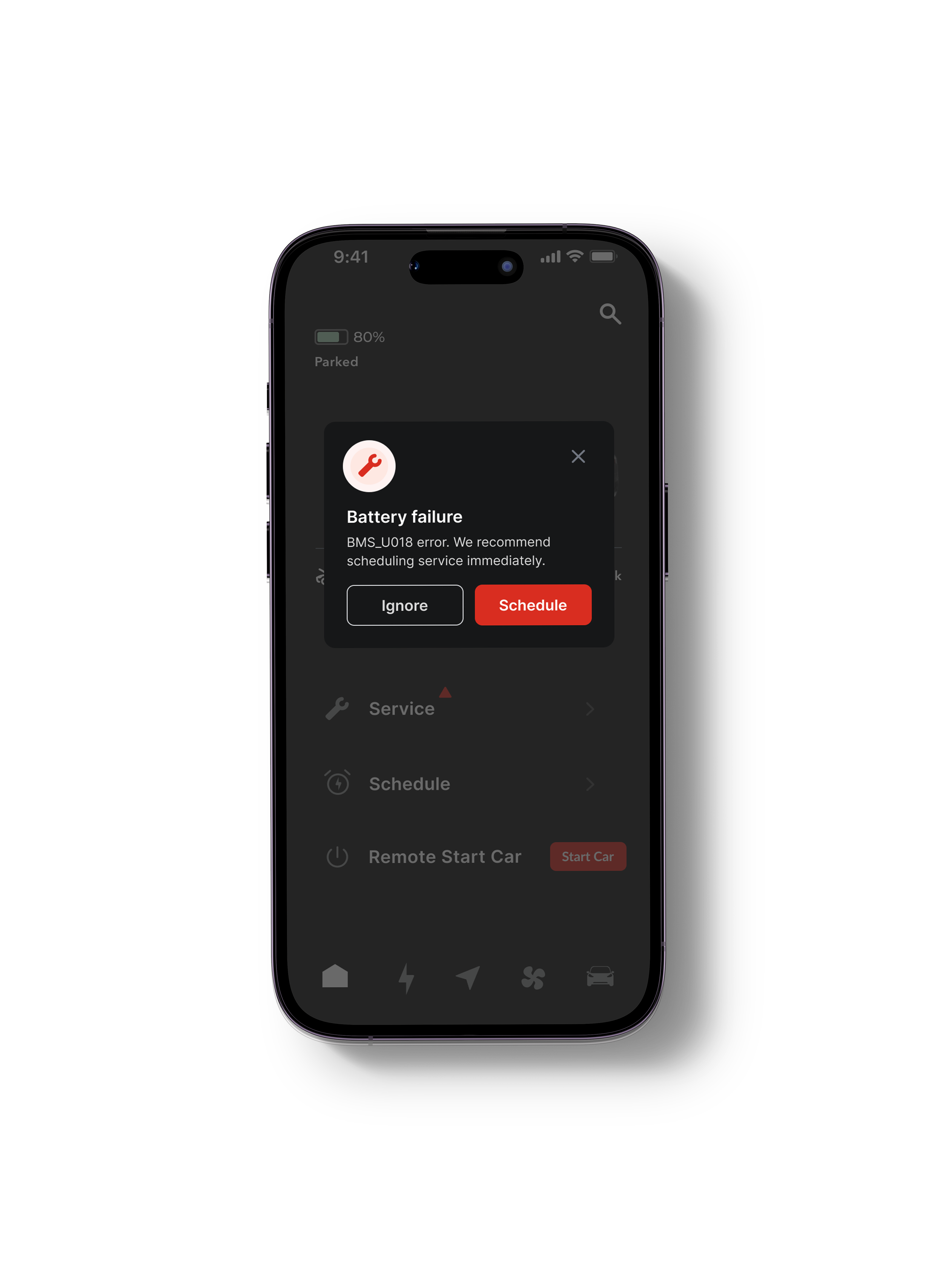
the Tesla app
blueprint
customer journey map

Current State
In the current app experience there is no where to schedule service, but there is a schedule tab for scheduling departures and charging.
Redesign
references


https://www.ranzlaw.com/why-are-tesla-car-accident-rates-so-high/
https://pmc.ncbi.nlm.nih.gov/articles/PMC3999409/
https://clients-mintel-com.artcenter.idm.oclc.org/report/perceptions-of-auto-brands-us-2024?fromSearch=%3Ffreetext%3Dtesla%26resultPosition%3D7
https://www.mckinsey.com/industries/automotive-and-assembly/our-insights/how-do-consumers-perceive-in-car-connectivity-and-digital-services