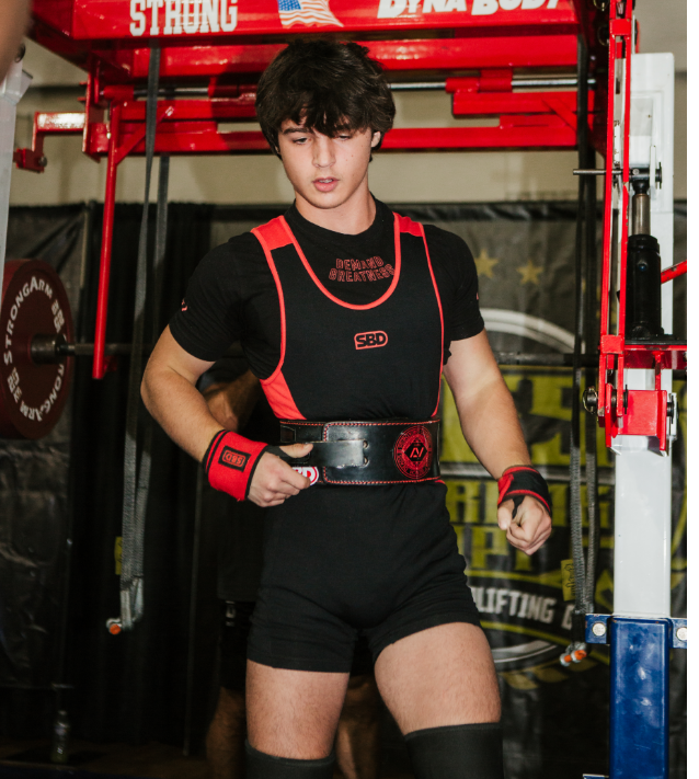
Spencer’s Powerlifting
INDUSTRY: Sports
SERVICES: Creative Direction, Branding, Photography
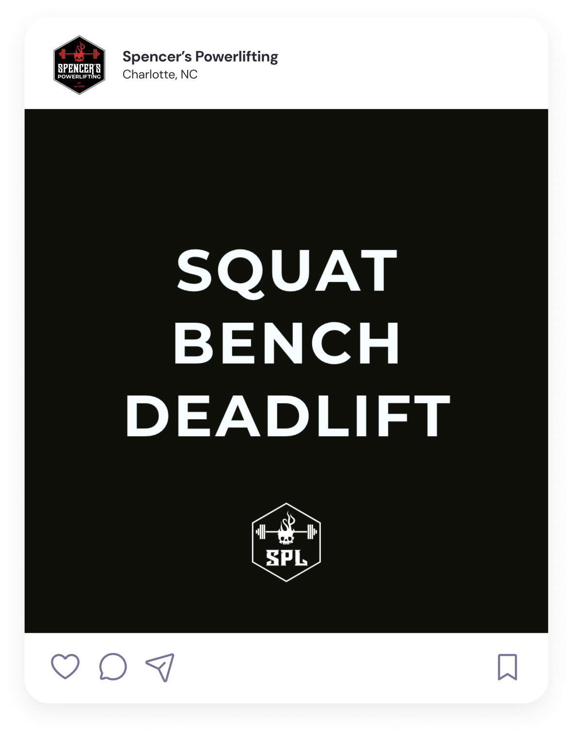
BRAND TONE
Gritty, Disciplined, Fierce, Relentless, Determined, Confident, Explosive
ABOUT THE PROJECT
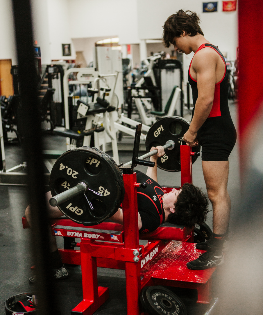
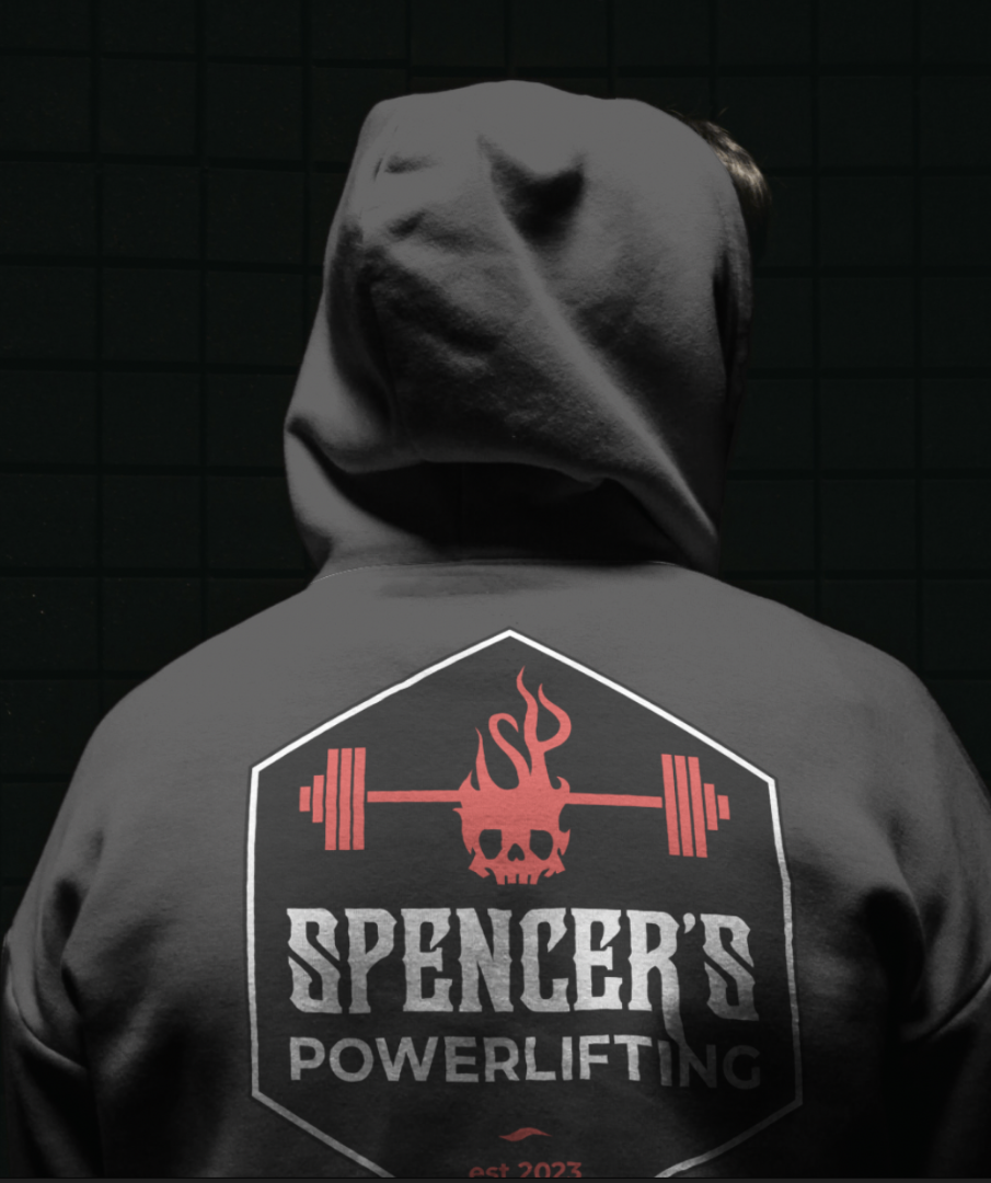
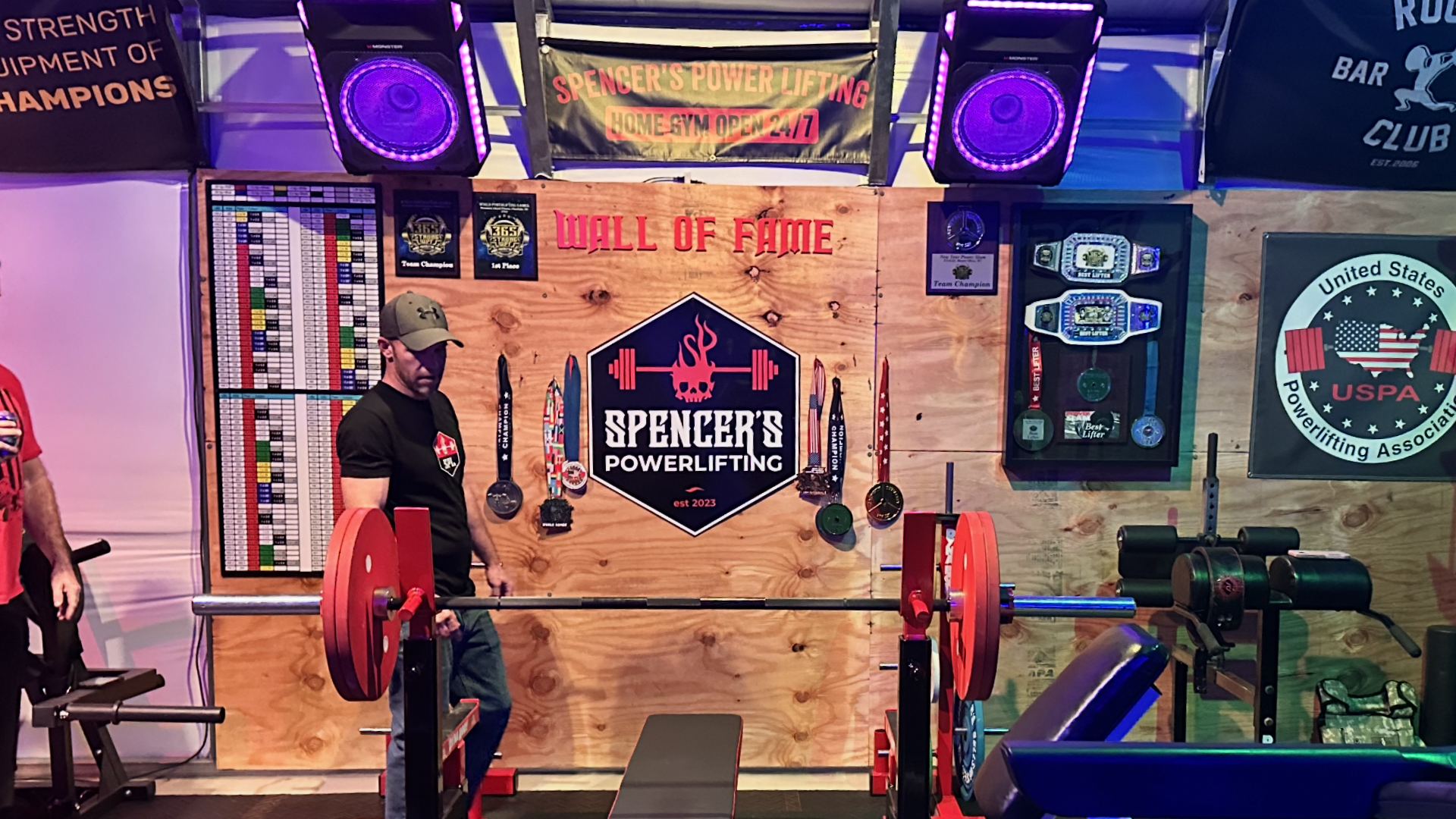
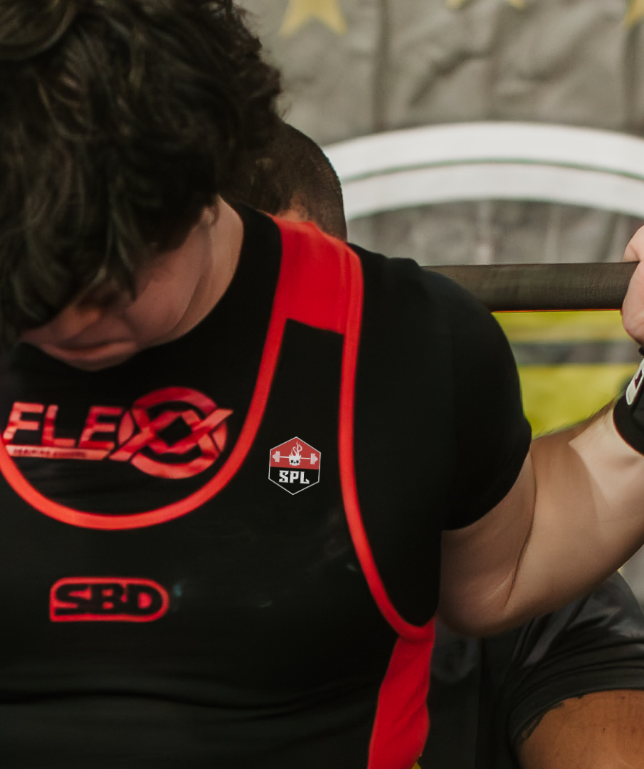
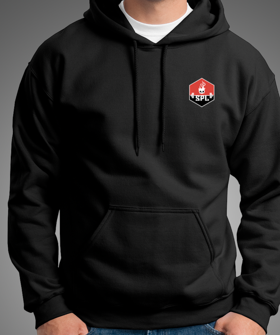
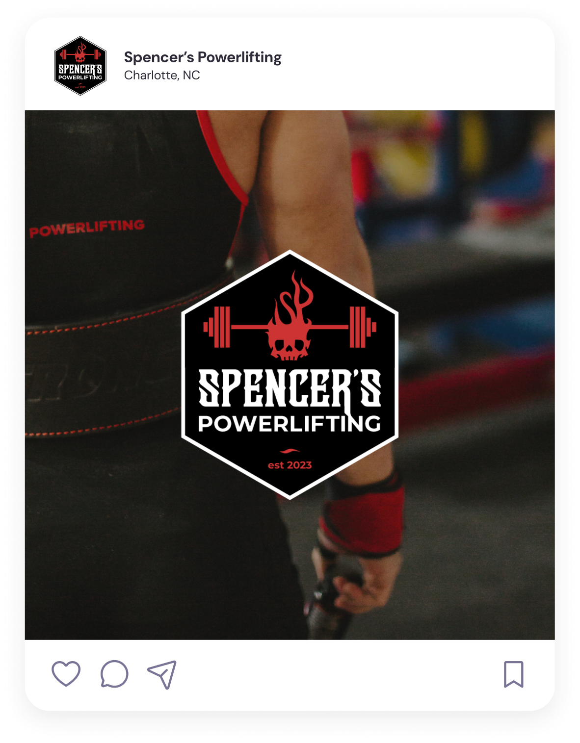
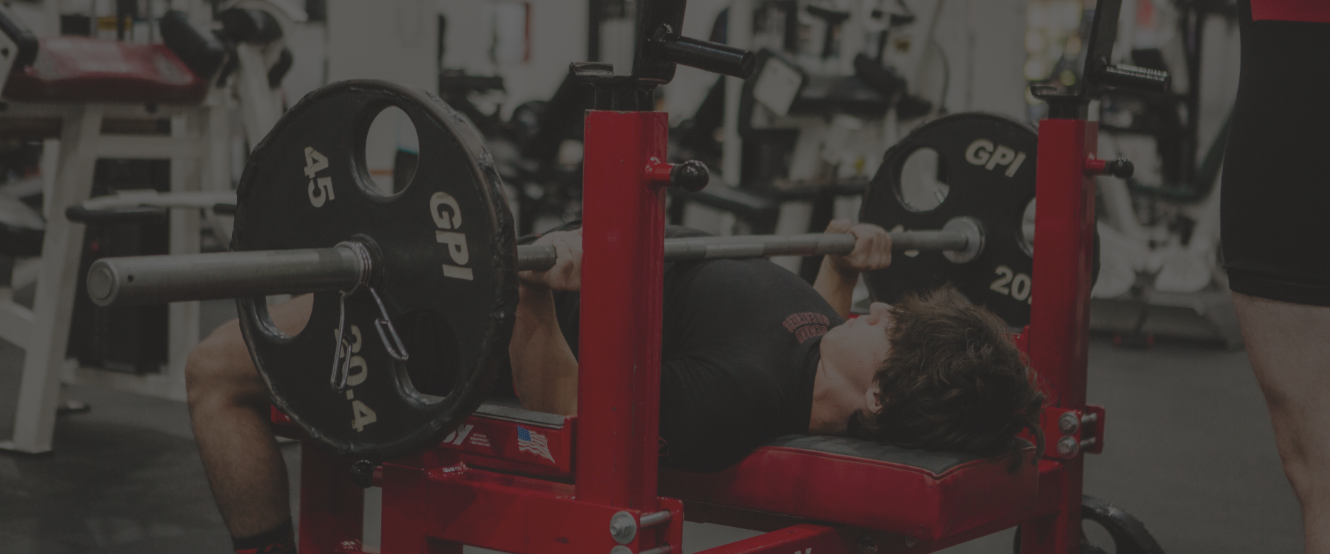
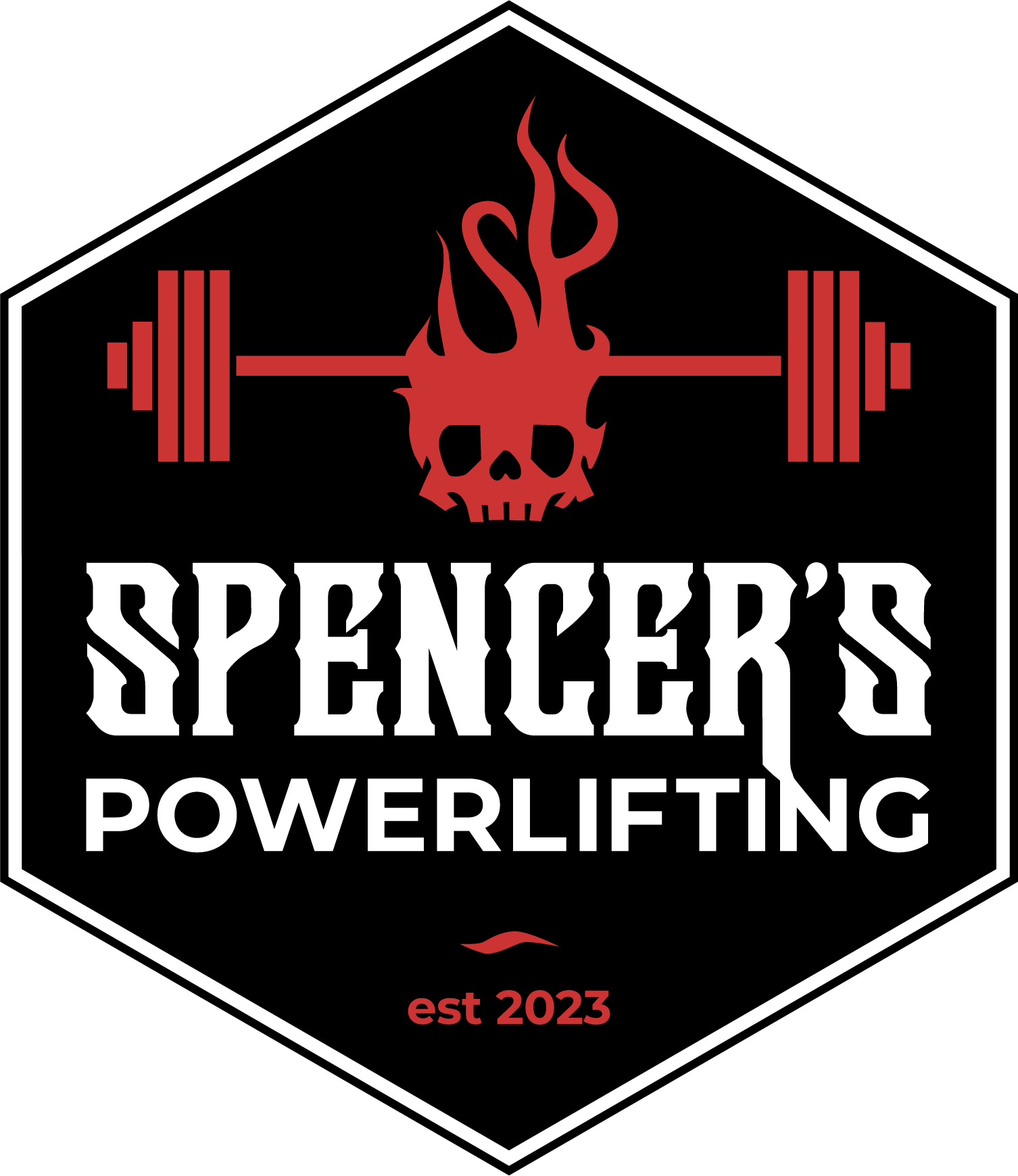
For Spencer’s Powerlifting, the goal was to create a brand identity that reflected strength, precision, and personal achievement, not just another generic gym logo. Grounded in the athlete’s journey and competitive mindset, the final mark is packed with intentional meaning.
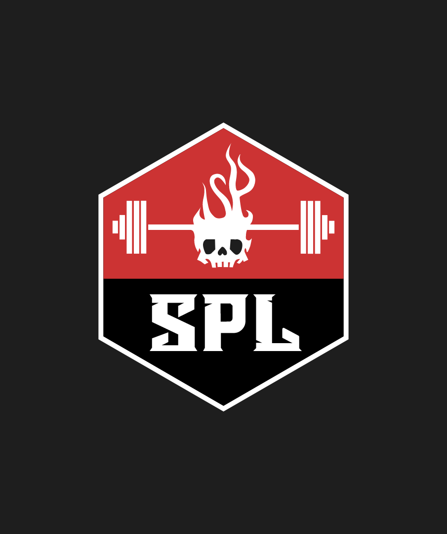
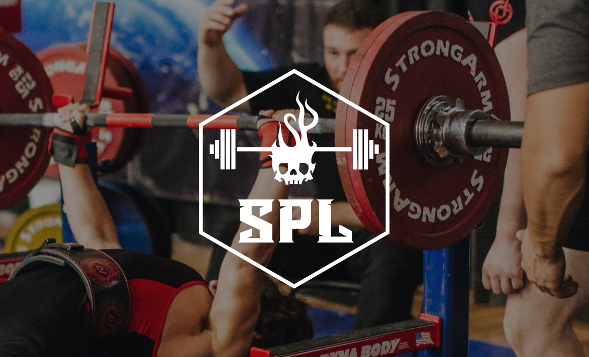
At first glance, the logo feels bold and powerful. But a closer look reveals the flames subtly form an “S” and a “P,” nodding to the Spencer’s Powerlifting initials and adding a layer of hidden symbolism. These quiet “Easter egg” details create a deeper connection between the brand and the person behind it.
The barbell at the center is intentionally loaded with 500 lbs, representing the personal record the team’s primarily athlete was chasing during the project, which is a goal he went on to hit in his very next competition. Even the diamond pattern pulls from the knurling of a barbell, grounding the identity in the gritty and tactile reality of training.
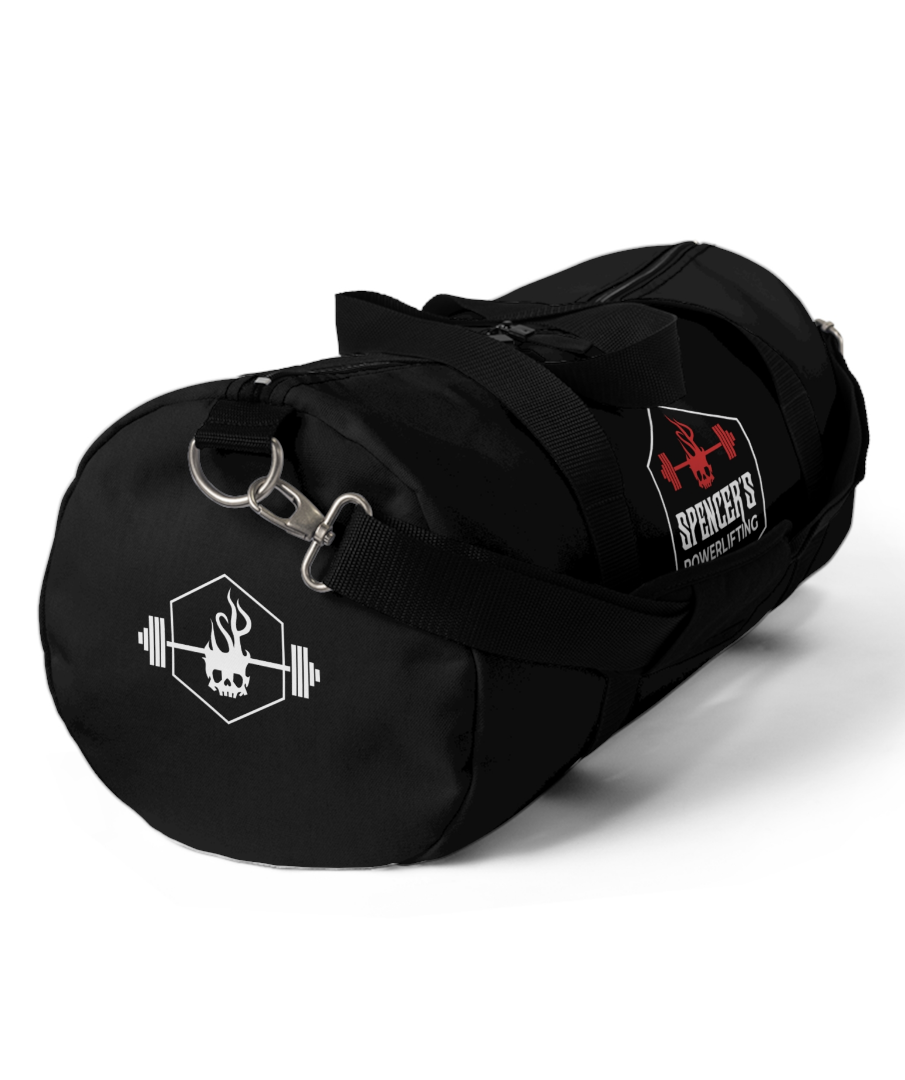
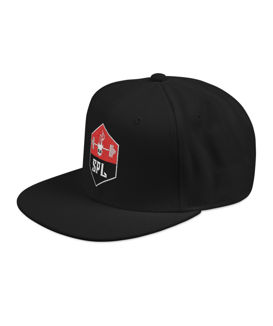
The resulting design is a visually striking mark rooted in the culture, goals, and personality of the powerlifting culture— a brand identity built with intent, pride, and power in every rep.